DIN@: Agilize's Design System
What is Agilize?
Agilize is one of Brazil's first online accounting platforms — they handle the full accounting cycle for SMBs, from setup to monthly tax filings. I joined as one of the first UX designers on the product, when the design function was effectively starting from zero.
What was the problem?
Years of organic growth without dedicated design had fragmented the product visually — three button styles, inconsistent spacing, no shared vocabulary between design and dev. Every new feature meant reinventing UI from scratch, slowing delivery and making the product feel disjointed.
How did I approach it?
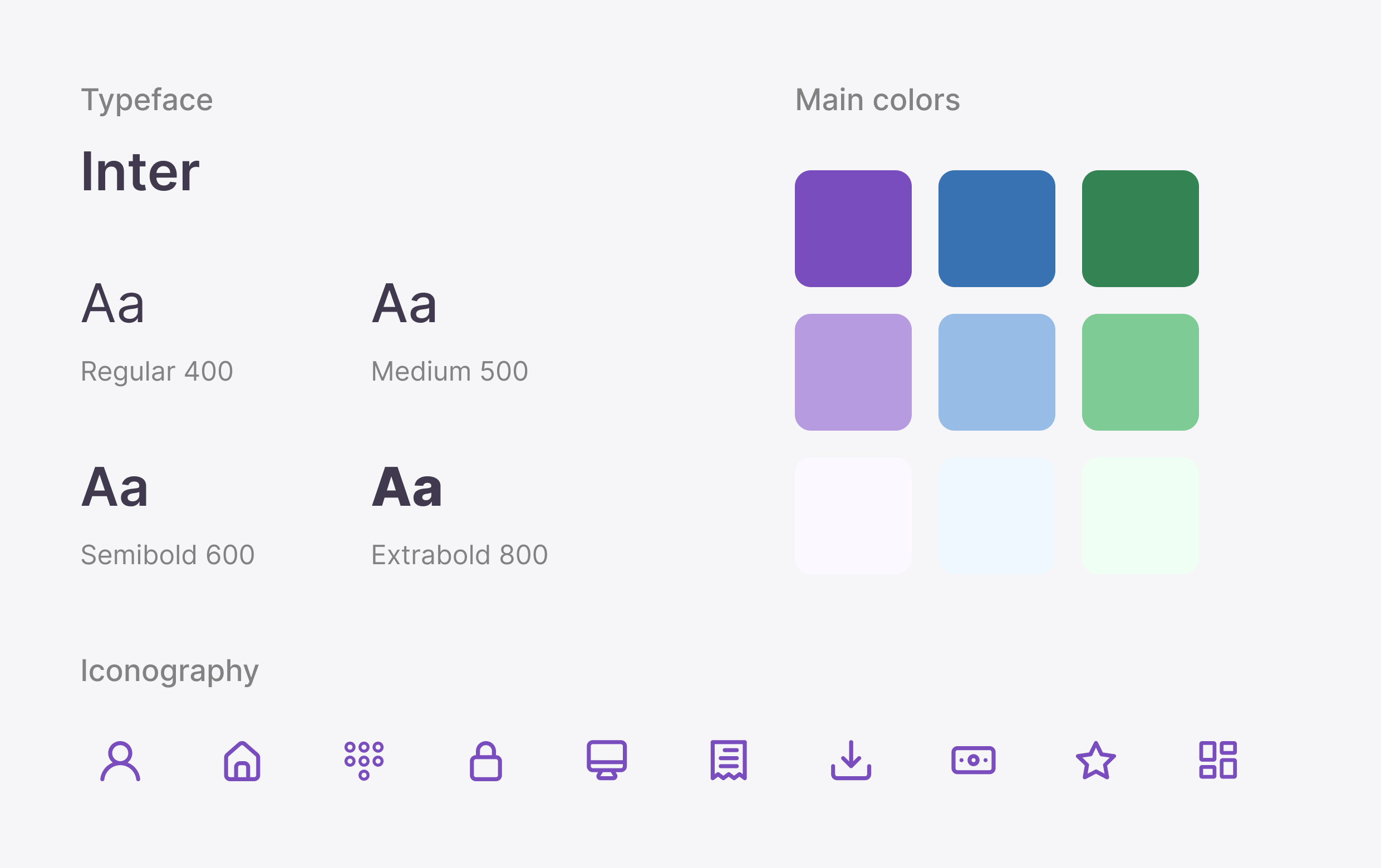
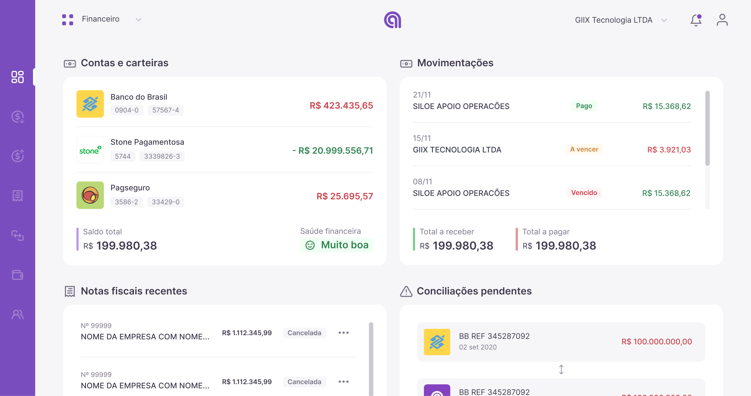
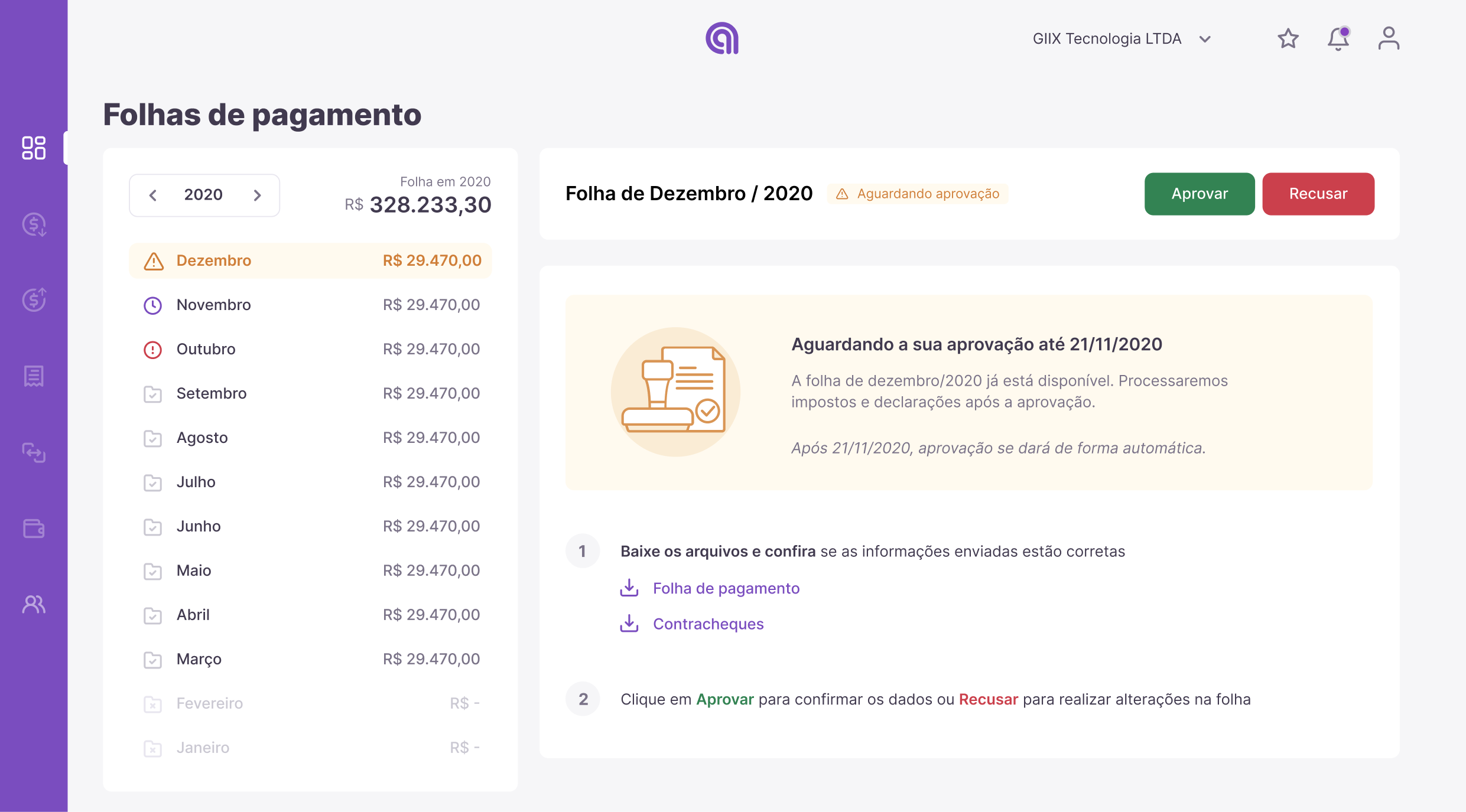
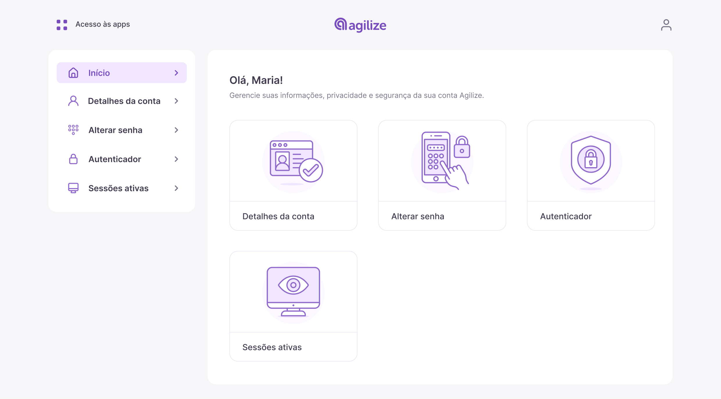
I led the creation of DIN@ — Agilize's first design system — working alongside the design team. We started with foundations (Inter typeface, a structured purple-anchored palette, custom icon set), then built core components with usage rules and dev handoff specs. We rolled DIN@ into priority modules first (financial dashboard, payroll, account management) so the team could validate in production rather than wait for full coverage.
What was the outcome?
We shipped the DIN@ MVP in 3 months. The financial dashboard, payroll, and onboarding flow were rebuilt on the new system within six months, and DIN@ became the shared language between design and engineering at Agilize.
Lesson: design systems are 30% Figma and 70% advocacy — adoption is everything.