Rethinking the Midway mobile experience
What is Midway?
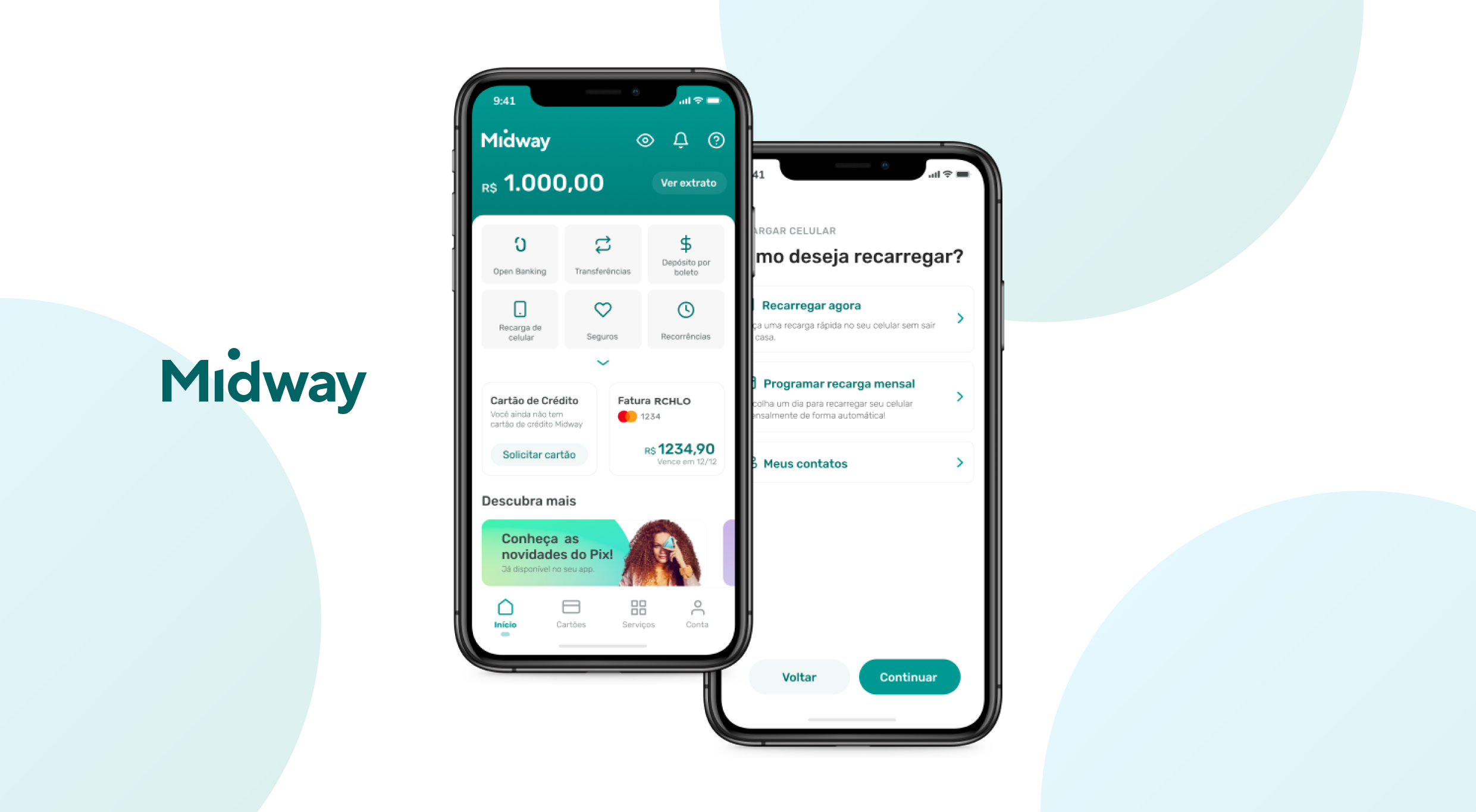
Midway is the digital banking app of Riachuelo, one of Brazil's biggest retailers — 1M+ active mobile users. As one of 12 designers at NTT DATA's Midway team, I worked on the broader app redesign and led the creation of MIDS, the design system underneath it.
What was the problem?
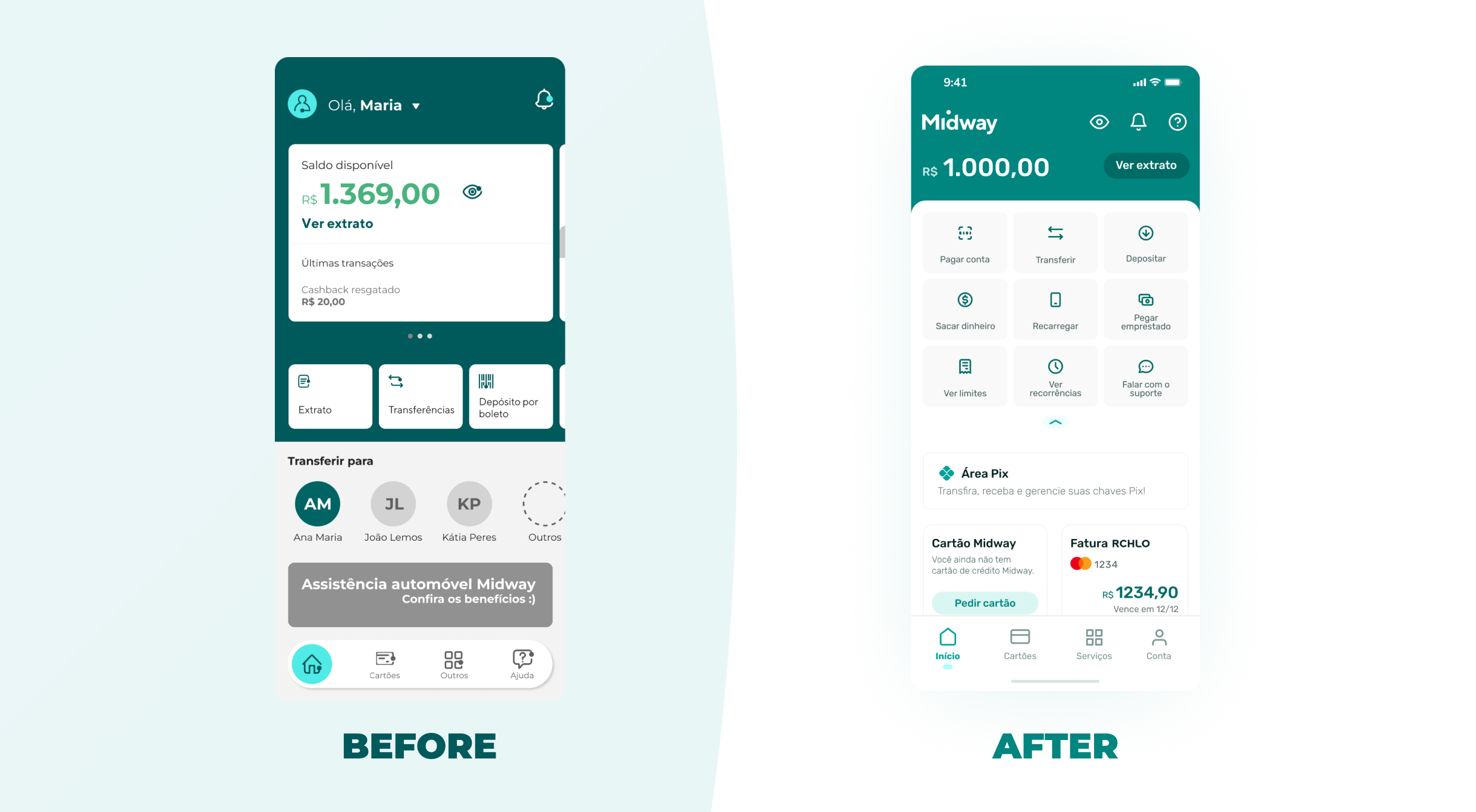
Years of feature additions had fractured the design — three button styles, ad-hoc patterns, no shared vocabulary between design and engineering. Designers kept solving the same problems differently; developers kept rebuilding from scratch. Users felt the chaos most on the home screen, which tried to show too much at once.
How did I approach it?
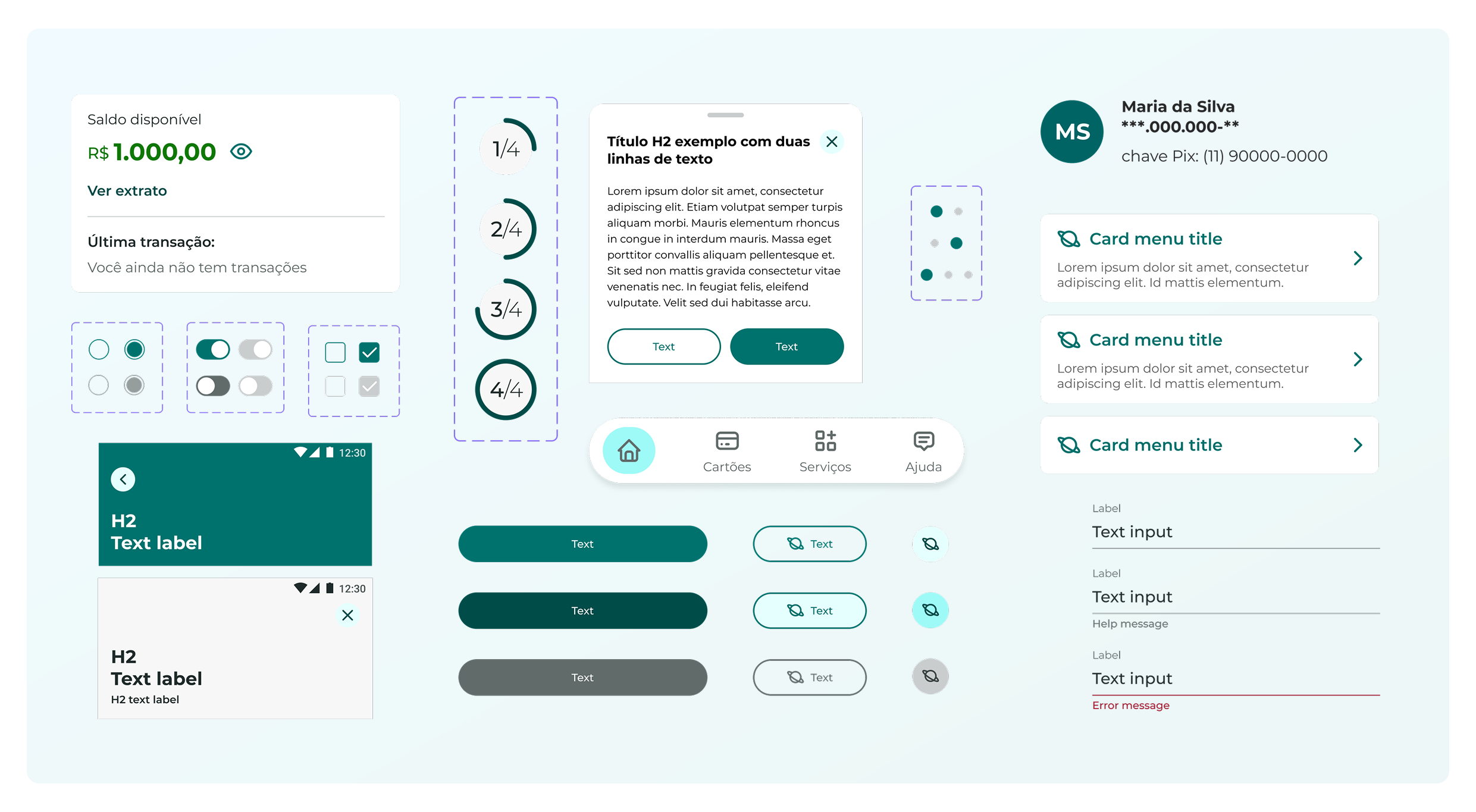
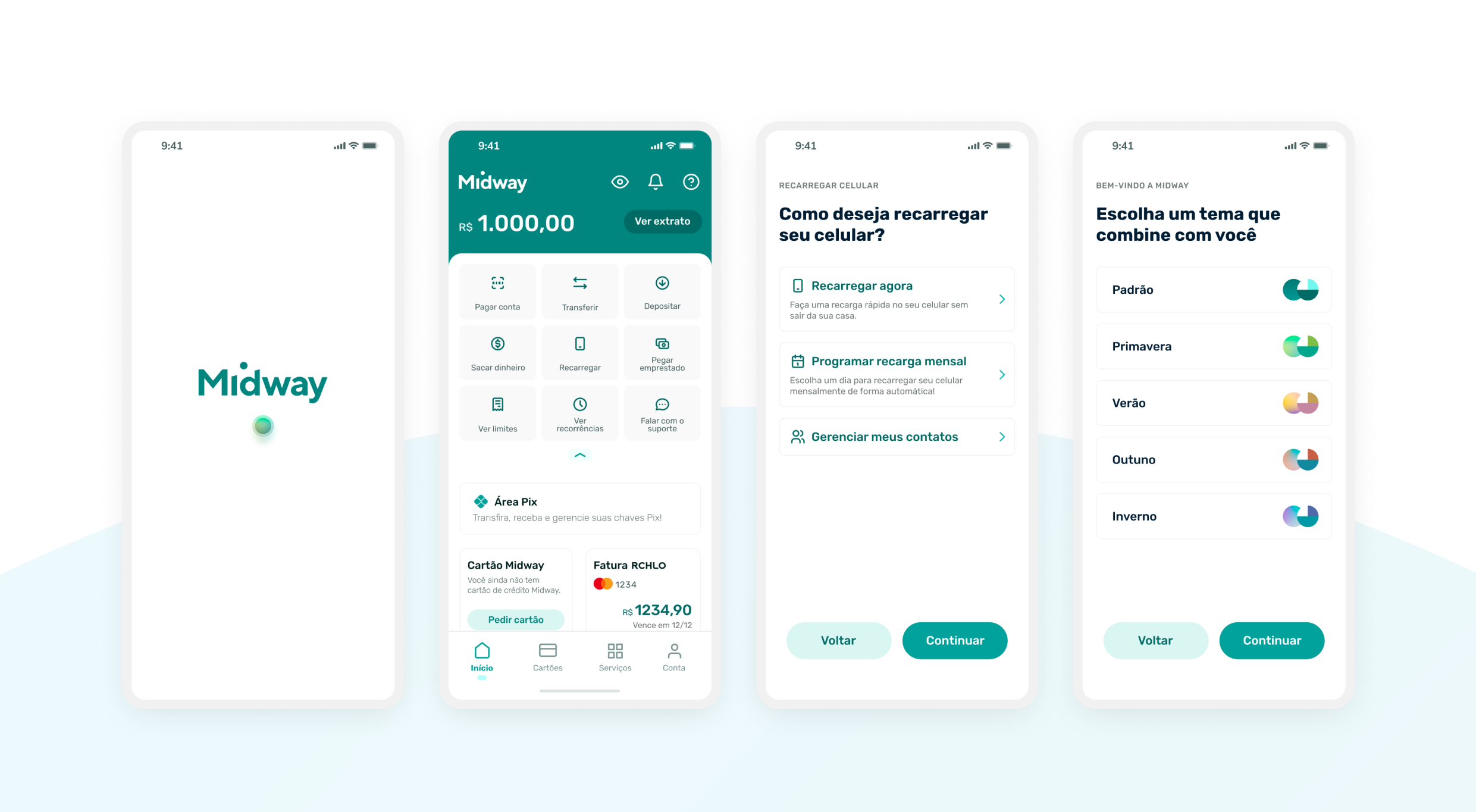
I led the foundation of MIDS, running audits and ceremonies to align the team on tokens, components, and patterns. With the system in place, we rebuilt the mobile app around two principles: prioritise the most-used actions on the home screen (Pix, transfers, payments), and let users personalise the experience through seasonal themes that change the visual mood without breaking the system.
What was the outcome?
MIDS reduced design process time by 33% across the 12-person team. The redesigned app shipped with a cleaner home screen and a more accessible component foundation engineering could build on for years.
Lesson: a design system isn't a Figma file — it's a shared language. Adoption is the metric that matters, not coverage.